5 Visualisation and modelling
5.1 Case study
The best way to show you the power of visualisation for knowledge generation is by means of an example. In this part, you will use a dataset comprised of subjects who were part of a study aimed at understanding the prevalence of diabetes in central Virginia, USA. The variables describing the subjects are:
- id: A numeric ID for each subject.
- ratio_ch: Cholesterol/High Density Lipoprotein ratio.
- stab.glu: Stabilised glucose.
- glyhb: Glycosolated haemoglobin.
- location: County of origin.
- age: Age of the subject.
- gender: Gender of the subject.
- ratio_wh: Waist/Hip ratio.
- body_measure: Which body measurement was recorded.
- measure: Height or weight of the subject.
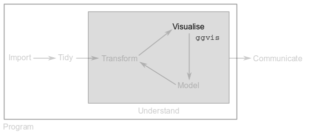
After tidying and transforming the “Diabetes Dataset”, you will visualise relationships between variables and feature distributions with functions from package ggvis in order to propose a simple model for susceptibility to diabetes.
You must load packages tidyverse and ggvis.
5.1.1 Exercise 5.1
- Import file
datasets/diabetes.tsvinto variablediab. - Tidy up the imported
tibbleby piping a series oftidyroperations and assign the result to variablediab. - Get rid of column
id. - Use
mutate()andas.numeric()to transform character columns that should be numeric. - Height, waist and hip measurements are given in inches, convert them to centimetres (1 inch = 2.54 cm).
- Weights are given in pounds, convert them to kilograms (1 pound = 0.454 kg).
- Glycosolated haemoglobin levels above 7.0 are usually taken as a positive diagnosis of diabetes. Create a new column called
diagnosisthat takes the value “diabetic” when a subject’s level is greater than 7.0 and “healthy” otherwise (HINT: read the documentation for functionifelse()).
5.2 Plotting with ggvis
In order to plot with package ggvis, we need the %>% operator to channel information into function ggvis(). This creates a blank canvas on top of which we add layers of information and polish our plot:
diab %>%
  ggvis(x = ~age, y = ~chol) %>%
  layer_points() %>%
  add_axis("x", title = "Subject's age") %>%
add_axis("y", title = "Cholesterol level")The above example feeds function ggvis() with the diab table, indicates that we want to compare age with cholesterol levels (note the ~ before each variable name), uses layer_points() to generate a scatter plot with the data and polishes the plot by providing custom titles via add_axis().
You will see that following this syntax allows you to generate many different types of plots. It’s just a matter of changing the layer function or adding more layers to your plot:
diab %>%
  ggvis(x = ~age, y = ~chol) %>%
  layer_points(size := 100, shape := "diamond") %>%
  layer_smooths(se = TRUE) %>%
  add_axis("x", title = "Subject's age") %>%
add_axis("y", title = "Cholesterol level")See how the above example adds a layer_smooths() on top of layer_points(). Also, note that it is possible to further polish the plot via parameters that are specific to each type of layer. For example, we can change the size and shape of points through parameters size and shape of function layer_points().
Finally, it is possible to add interactivity to our plots as follows:
diab %>%
  ggvis(x = ~age, y = ~chol) %>%
  layer_points(size := input_slider(label = "Size",
                                    min = 10, max = 100, step = 5),
               shape := input_select(label = "Shape",
                                     c("Circle" = "circle",
                                       "Square" = "square",
                                       "Diamond" = "diamond"))) %>%
  add_axis("x", title = "Subject's age") %>%
  add_axis("y", title = "Cholesterol level")
R Notebooks cannot show interactive plots, but you can try the above code in the RStudio console.
5.3 Bar plots
Bar plots are useful when we want to graphically show counts of a discrete or categorical variable. For example, to see the number of male and female subjects in diab we do:
diab %>%
  ggvis(x = ~gender) %>%
  layer_bars(width = 0.5) %>%
  add_axis("x", title = "Gender") %>%
add_axis("y", title = "Number of subjects")Note how the width parameter of layer_bars() has been used to plot narrow bars.
We can also see the number of diabetic and healthy subjects:
diab %>%
  ggvis(x = ~diagnosis) %>%
  layer_bars(width = 0.75) %>%
  add_axis("x", title = "Diagnosis") %>%
add_axis("y", title = "Number of subjects")Finally, we can also use the y-axis of bar plots to show information other than counts. For example, we can contrast the average cholesterol levels of men and women:
diab %>%
  group_by(gender) %>%
  summarise(avg_chol = mean(chol)) %>%
  ggvis(x = ~gender, y = ~avg_chol) %>%
  layer_bars() %>%
  add_axis("x", title = "Gender") %>%
add_axis("y", title = "Avg. cholesterol")Note how data transformations can be applied on the fly and piped to ggvis().
5.4 Scatter plots and regressions
Scatter plots allow us to study the relationships between two numerical variables and regressions try to find the curve that best describes how x is related to y.
Let’s see how weight and waist measurements are related:
diab %>%
  ggvis(x = ~weight, y = ~waist) %>%
  layer_points() %>%
  layer_smooths(se = TRUE) %>%
  add_axis("x", title = "Subject's weight") %>%
add_axis("y", title = "Waist measurement")In the above example, layer_points() is in charge of the scatter plot and layer_smooths() finds a curve that follows the points and summarises the observed trend. Parameter se is set to TRUE to show a standard error band that indicates how much we can trust the regression curve.
If we want to have more control over the type of curve that is fitted to the points, we can use layer_model_predictions(). For example, to fit a straight line to the above plot, we have to use a linear regression model (“lm”):
diab %>%
  ggvis(x = ~weight, y = ~waist) %>%
  layer_points() %>%
  layer_model_predictions(model = "lm", se = T) %>%
  add_axis("x", title = "Subject's weight") %>%
  add_axis("y", title = "Waist measurement")
## Guessing formula = waist ~ weightEven though a scatter plot is intrinsically 2D, we can add more layers of information to learn more about our data. For example, we can colour our points according to the subject’s diagnosis and adjust their size by glyhb:
diab %>%
  ggvis(x = ~weight, y = ~waist) %>%
  layer_points(fill = ~diagnosis, size = ~glyhb) %>%
  add_axis("x", title = "Subject's weight") %>%
  add_axis("y", title = "Waist measurement") %>%
  add_legend("fill", title = "Diagnosis") %>%
  add_legend("size", title = "Glycosolated haemoglobin",
properties = legend_props(legend = list(y = 100)))Note how add_legend() was used to polish the title and position of the legends.
5.5 Line graphs
Line plots are similar to scatter plots, but the variable in the x-axis is sorted and points are connected in order with a line:
diab %>%
  ggvis(x = ~waist, y = ~hip) %>%
  layer_lines() %>%
  add_axis("x", title = "Waist measurement") %>%
add_axis("y", title = "Hip measurement")It is very common to add a point layer on top of line plots:
diab %>%
  ggvis(x = ~waist, y = ~hip) %>%
  layer_lines() %>%
  layer_points() %>%
  add_axis("x", title = "Waist measurement") %>%
add_axis("y", title = "Hip measurement")5.6 Box plots
Box plots are very powerful statistical tools that summarise the most important aspects of a variable’s distribution:

The x-axis in a box plot is usually a categorical variable and the y-axis is normally a numeric variable who’s distribution we want to explore. For example, let’s visualise the distribution of High Density Lipoprotein values for males and females in diab:
diab %>%
  ggvis(x = ~gender, y = ~hdl) %>%
  layer_boxplots() %>%
  add_axis("x", title = "Gender") %>%
add_axis("y", title = "High density lipoprotein")5.7 Histograms and densities
Histograms work on a single variable and show how it is distributed by dividing its range into a certain number of bins. Thus, the x-axis reports the values that the variable can take (binned) and the y-axis reports the number or fraction of observations that take such values.
Let’s look at the distribution of Stabilised glucose values, specifying the width of the histogram bins with parameter width:
diab %>%
  ggvis(x = ~stab.glu) %>%
  layer_histograms(width = 15) %>%
  add_axis("x", title = "Stabilised glucose") %>%
add_axis("y", title = "Counts")We can also put two histograms in the same plot:
diab %>%
  group_by(diagnosis) %>%
  ggvis(x = ~stab.glu, fill = ~diagnosis) %>%
  layer_histograms(width = 15) %>%
  add_axis("x", title = "Stabilised glucose") %>%
  add_axis("y", title = "Counts") %>%
add_legend("fill", title = "Diagnosis")Density plots are like regressions but for histograms. Density plots try to find the curve that best summarises the distribution of a variable and report probability densities instead of counts. To control the wiggliness of the density plot, we use parameter adjust:
diab %>%
  ggvis(x = ~stab.glu) %>%
  layer_densities(adjust = 0.7) %>%
  add_axis("x", title = "Stabilised glucose") %>%
add_axis("y", title = "Density")Since choosing the appropriate width or adjust for histograms or density plots is not straightforward, it is common to add interactivity to these kind of plots. For example:
diab %>%
  ggvis(x = ~stab.glu) %>%
  layer_densities(adjust = input_slider(min = .1, max = 1,
                                        value = 0.7, step = .1,
                                        label = "Bandwidth")) %>%
  add_axis("x", title = "Stabilised glucose") %>%
  add_axis("y", title = "Density")
5.8 A simple model
In Exercise 5.1, you used Glycosolated haemoglobin levels above 7.0 to diagnose diabetes. The histograms from the previous section showed that diabetics have bigger levels of Stabilised glucose compared to healthy subjects.
5.8.1 Exercise 5.2
- Generate a scatter plot comparing
glyhbwithstab.gluusing the subject diagnosis as the point colour. - Discuss with your classmates about a possible model to refine the diabetes diagnosis with these two variables.
5.9 Base R plots and ggplot2
Before we conclude, it is important to mention that R has several systems for making graphs.
Base R offers functions like plot(), boxplot() and hist(), but it is difficult to modify and save the resulting plots.
Package ggplot2 is very similar to ggvis but uses the + operator instead of %>%. ggplot2 is one of the most versatile and elegant systems in R to generate static plots and it is also part of the tidyverse. For more on this great package, visit ggplot2’s website.